A Brand With One Goal: To Feed The Future.
AppHarvest
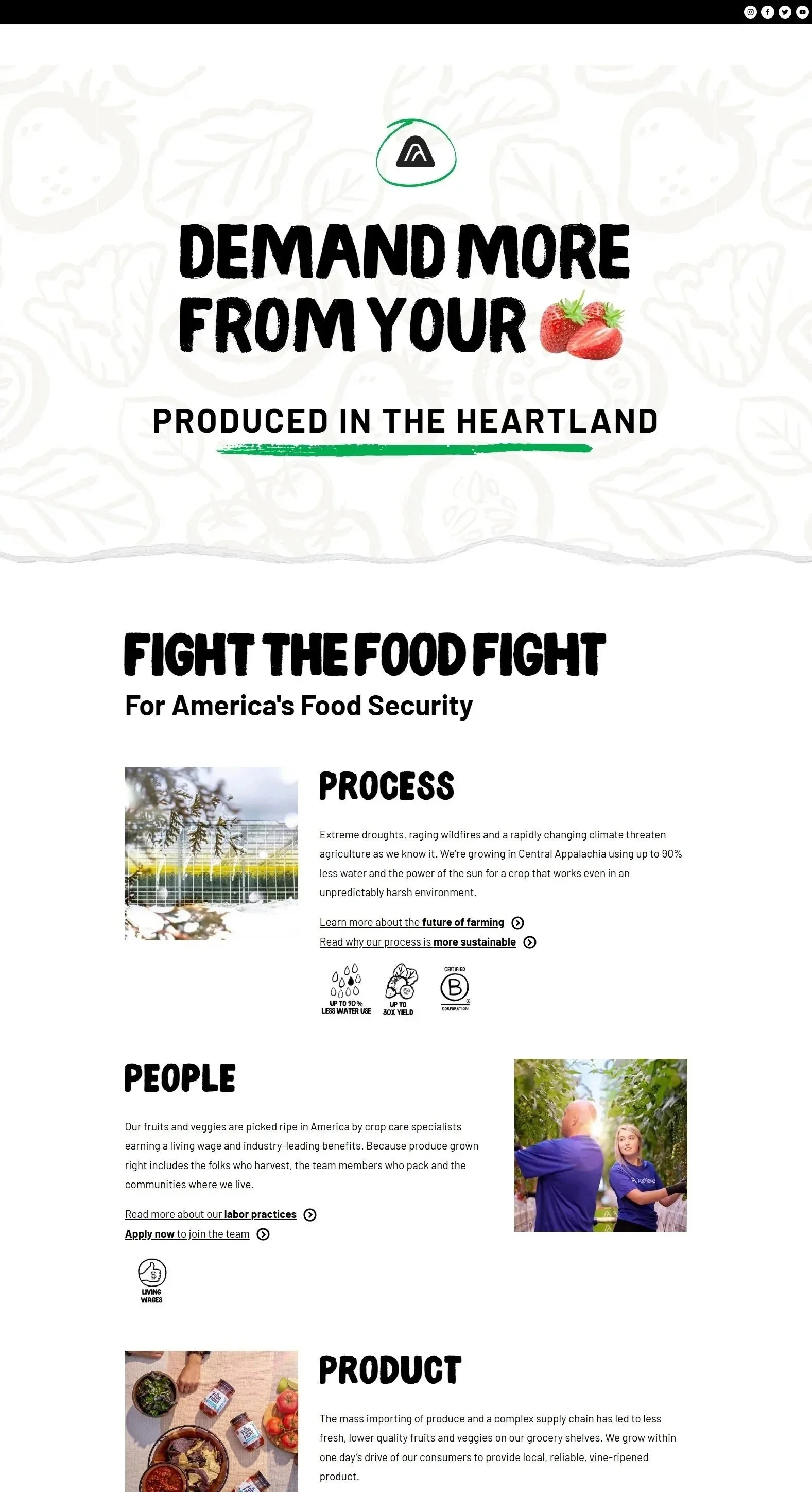
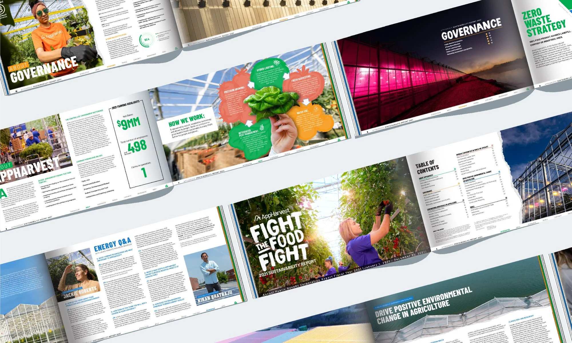
AppHarvest is a purpose-driven applied technology company in Appalachia developing and operating some of the world’s largest high-tech indoor farms. Starting it’s journey as a small start-up company then taking on the ambitious goal of becoming a publicly traded company really tested the initial branding. AppHarvest therefore wanted to update its visual identity, brand strategy and digital design to represent this new level of disruption and impact.

As Creative Lead at AppHarvest, I helped elevate the brand from a startup identity to a NASDAQ ready presence. Working with my team and the executive team, I led design and brand development that reflected the company’s mission of building a resilient, American-owned food system while uniting sustainability, innovation, and community under a cohesive visual voice.
Art Direction
Branding
Web Design
Packaging
Design
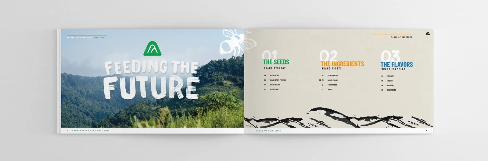
AppHarvest’s brand strategy serves as the seeds from which the expression of the brand grows. It sets the framework that grounds us and inspires us. Use these foundational principles as the basis for all brand communication and design.
Brand Strategy

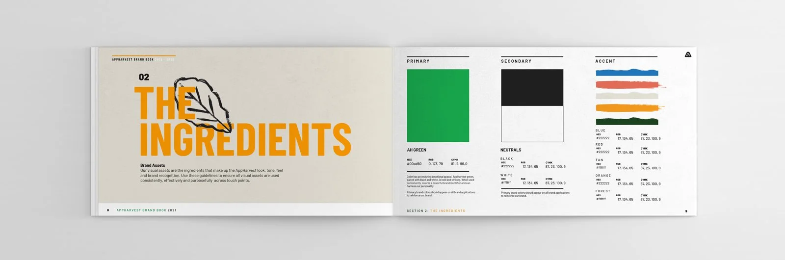
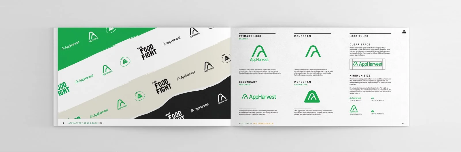
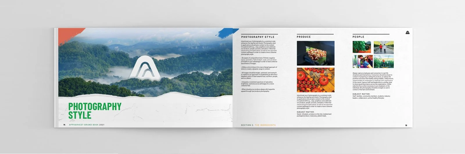
AppHarvest’s visual assets are the ingredients that make up the AppHarvest look, tone, feel and brand recognition. These guidelines ensure all visual assets are used consistently, effectively and purposefully across touch points.
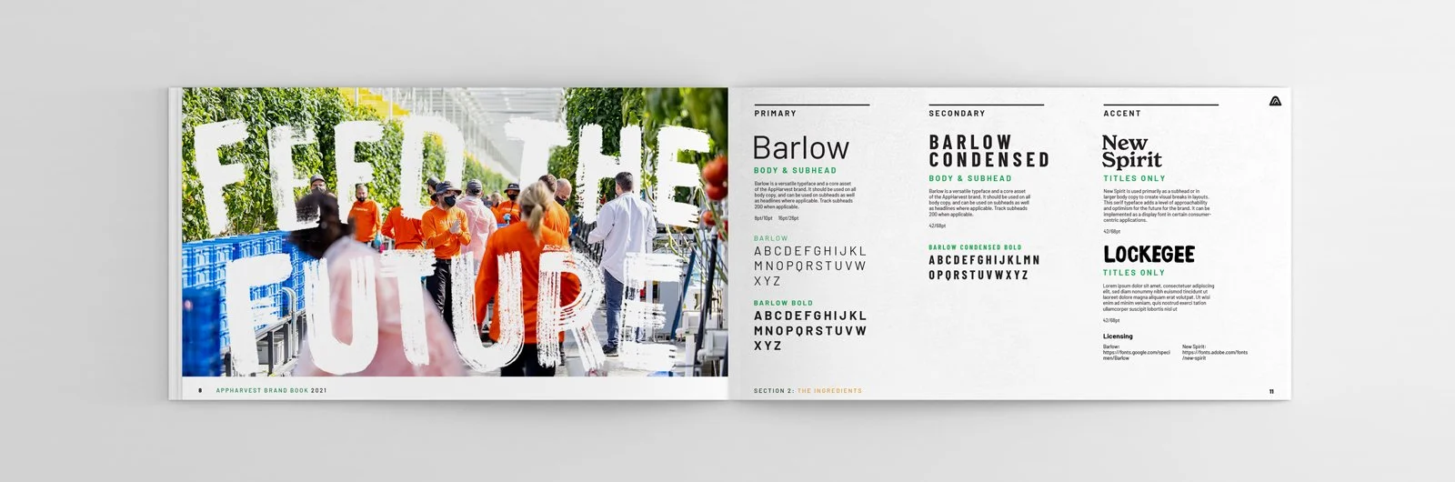
Typography

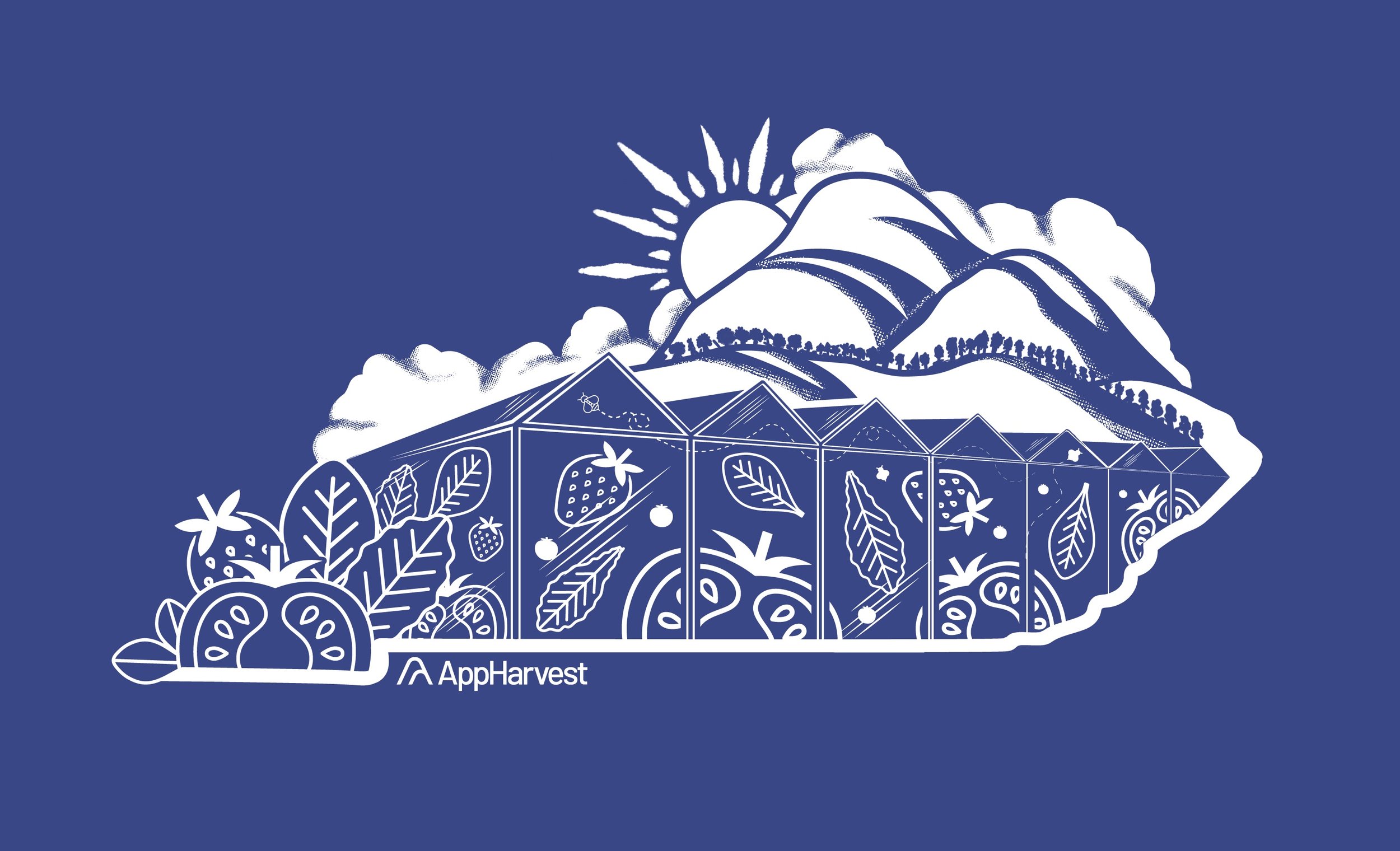
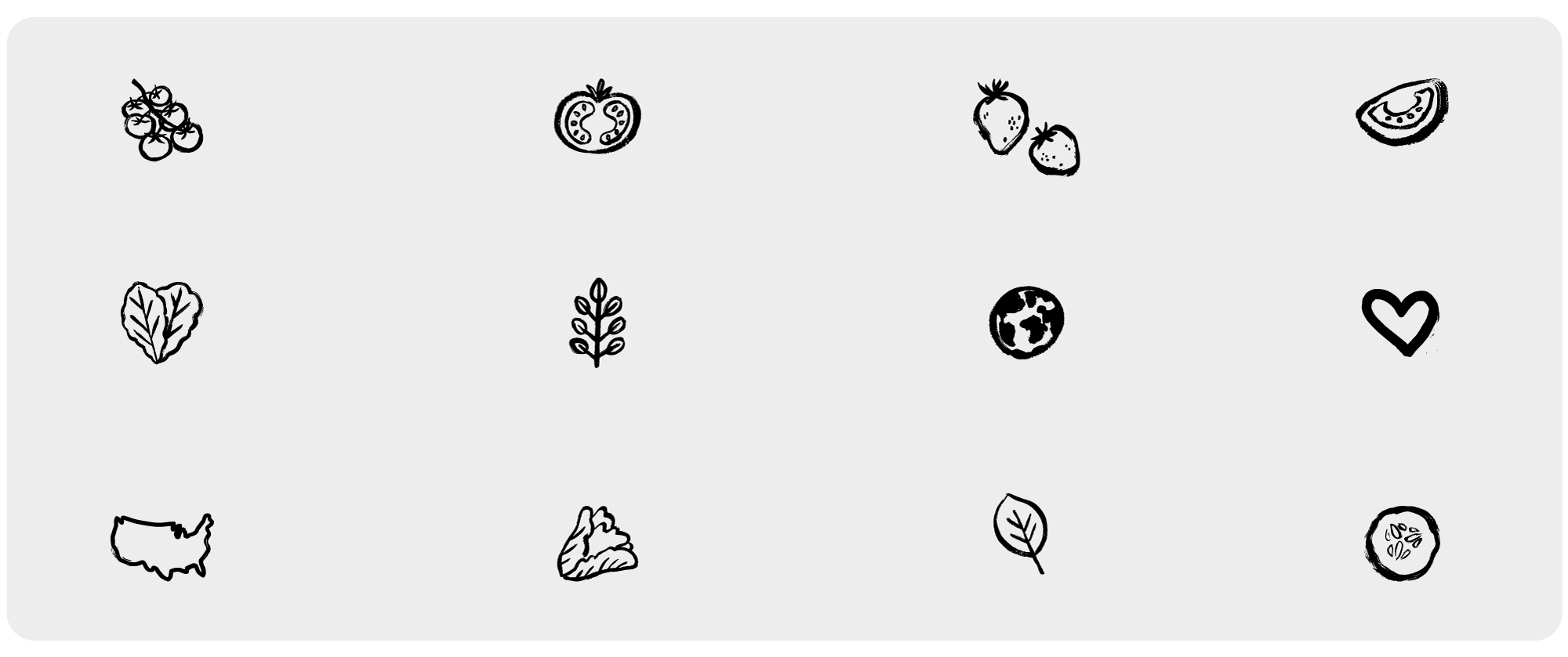
AppHarvest’s icons bring warmth, movement, and a dynamic element to the brand. The loose, hand-drawn style not only sets them apart from others, but further emphasizes the human hand behind everything they do. It helps create an environment which makes space for bold statements in playful lettering. Additionally, the icons add a textural element. They’re a little gritty/dirty...showing in true American spirit, “we’re not afraid to get our hands dirty as we work toward a better future”.
Iconography
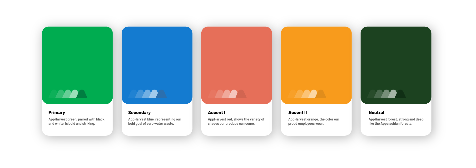
Color has an enduring emotional appeal. AppHarvest green, paired with black and white, is bold and striking. When used strategically with other accent colors you can really harness AppHarvest’s roots and personality. When used correctly all colors also have a primary function with in the design system that supports the purpose of the content, communicates hierarchy or interactive states.
Color Palette